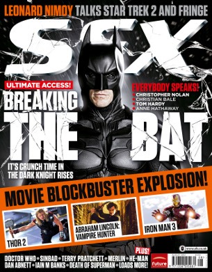
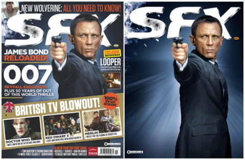
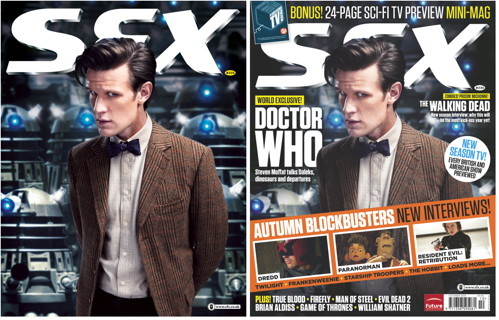
The task was to take five pictures in the style of the product I did detailed research on; “SFX” magazine. These are just tests to try and work out the style, before I move on to my final photo shoot.
Of the many picture I took these are the five I picked.


The next step was to choose three of the five images and alter them in Photoshop: New back grounds, Colour correction, lens flares etc.
Before:

The first step here was to cut out the figure and place him on a black background. I then added the sort of explosion effect with just an orange brush on a lowered opacity.
I played around with the RGB curves, altering the contrast. I tried to give the skin a kind of smooth, mat, look, to help it feel polished and cinematic. Finally a warming photo filter gave the figure his red-ish tint.
The effect I was going for was an image representing an action movie or prehaps TV drama that has a very polished and “done up” look.
After:

Before:

This one was probably the most complicated. I wanted to give the whole picture a blue tone and so photo filtered it that way and added the blu lens flare. However this gave the skin a really pale and lifeless look. So I made a layer that just covered the skin, trying to make it a bit reder and warmer. On top of this i used a very soft and low opactiy brush to draw in a blue light on the face and hand which represents the light from the lens flare.
I also cut out the eyes and pasted them onto a seperate layer so i coul brighten them and bring up the green level.
The idea behind all of this was to give the picture more colour. Whilst I liked the cold blue look as it matched the space theme it sort of left the figure looking very dull. I really just tried to sharpen it by putting more colour into it.
After:

Before:

For this picture I cut out the figure, placed him on a black background, and built up layers of mist infront of him and in the background.
For the couolors I used the RGB curves to ramp up the green of the whole picture. I then created a transparent black layer and used the brush to draw shadows on the left side. I then had another transparent layer which I used to paint a transparent green over the right side.
This just accentuated the light and shadows already in the picture, the shadows were already on the left and the lightest side the right.
Some other things I tinkered about with were the sword length( I just used free transform to stretch it out) And the colour of the figures shirt. In the original photo it’s striped pink and that didn’t really match the mysterious and intimidating tone. So I used the lasso to select just the visibal t-shirt, copied that into a new layer, and then used the image adjustments Black and White”. In hindesight I probably should have asked the subject to just wear a different shirt but I wasn’t really thinking about what the final tone of each picture would be at that stage.This is a mind set I should work on when taking an future photos.
The final thing added was a lens flare, put on the right to match the photos light sources.
I idea with the fog, green colours and accentuated shadows was to make the image creepy and mysterious, a tone sugested by the figures expression and cloths.
After: