Animation – Character Design

For this task we had to design characters for 2D, hand drawn animation. The character has to morph from the bouncing ball and carry out a walk cycle.

The first step was to sketch out ideas for the character, experiment with different looks and styles. After the initial concept sheet I then took the best of the ideas and turned them into the final design.

Design Sheet 8

I then create the final design sheet, which featured drawings of the characters front, back, side, and three quarter view.

Examples of character design sheets:

m-oliver_vCharacter-Concept-Sketch-Page-180-Degree-View-ExampleEdward_Cutler_Character_Sheet_by_SteampunkTyki

The only real rules I tried to follow are that the character has to have legs and feet so it can walk, as a walk cycle is the main goal of the character, and that it would be relatively simple so I’ll be able to draw it again and again over the many frames of animation.

My starting point for the character was that I wanted to create a very stylized Panda. I played around with sketching out different shapes, heights, and faces. Some early sketches had the panda quite cute and small and chubby, before I came across the idea of making him somehow dangerous and combat ready. I tried bulking the Panda up with big muscles, but I didn’t quite like that.

Design sheet 1

(Top Right Corner: A cute and small and chubby design)

Design Sheet 4

(A strange experiment, testing out how I could make the character sleek and ninja-like)

Design Sheet 7

(Different Faces)

Eventually I sketched a slimmer, more streamlined Panda. I developed it a bit more to try and create a ninja looking Panda.

The hardest bit to work out was the hands. I drew many variations, clawed, five fingered, three fingered, paws. I landed on three fingered with stubby, rounded, yet elegant fingers. They are soft and rounded by are made with these sweeping curve that end in a point where the finger nail would be.

Design Sheet 3Design Sheet 5

(Testing out hands)

Final design sheet:

Character design sheetFront and sideBack and 34

The final design turn around looks a little ninja, a little alien, almost what is would look like if a Panda was drawn in the style of Teenage Mutant Ninja Turtles. This works well I think, as I wanted a very stylized Panda that looked action ready.

Animation – The Bouncing Ball Exercise

Today we did the bouncing ball exercise using the traditional animation method of pencil and paper. We were given 31 sheets to complete the animation and a guide to the balls bouncing arc and its key frames. Each of the 31 sheets had the line to represent the ground already drawn on them and each was numbered, with the key frames numbers circled.

I then used the arc path sheet to trace an x on each frame. The x marked the center of the ball in that particular frame. I then did I similar process with the key frame sheet and traced the ball shape from the sheet onto the corresponding key frame.

Then it was down to me to fill in all the inbetween frames, using the marked places for the balls center.

When animating we have to keep these four principles of animation is mind.

Arcs-

In animation it will look for natural for things to move in an arc rather than a straight line. For example; someone jumping forward would look unnatural if the jumper when up in a straight line then down straight. So in this case he should travel in an arc, curving up then down.

Timing and Spacing-

Spacing, the distance the object moves in each frame, controls the speed of the animation. For example if I wanted to make an object move fast it would need to move a great distance between frames. If I want it to be slower, it should move less distance.

Ball fast time

Fast movement with large spacing.

Ball slow time


Slower motion with small spacing.

In terms of the bouncing ball animation this can be used to show gravity. As the ball initially falls it gains momentum, and so the frames hear will be very far apart. It then hits the ground and springs back up, still large spacing on the frames. But then, as it comes up from the bounce it enters a weightless section. To show this weightless period the frames should be closer together so that the balls movement appears slower.

Squash and Stretch-

To show energy and movement objects should be squashed and stretched as they move. This will sort of emulate motion blur, with the object distorted when at great speed. For example with the ball, as it picks up speed heading for the ground it begins to thin, turning into a lozenge shape. And then as it hits the ground it flattens, as if squashed by the impact. As the speed decreases squash and stretch should lessen. When the ball is going slowly during the weightless periods, it retains its shape completely.

Volume-

Whilst it is important to squash and stretch the moving object to show momentum and energy, the object must also keep the same mass. This is very important as a change in an objects mass will make it look like its growing or shrinking and give it a “mushy” look.

Whilst animating the ball I tried really hard to keep the volume the same and do the squash and stretch correctly. As the key frames and arc path had already been mapped out and traced onto the frames, doing correct squash and stretch was the only thing I had to think hard about myself. I flipped back and forth between the pages a lot; trying to make sure the size of the ball remained the same. As I was drawing one frame I would flip back to the last frame, and also the very first frame of the animation, to try and retain as much consistency as I could.

Unit 01 AO5 – Compare distribution channels and ownership patterns within media sector and explain your findings

The Dark knight Rises

tdkr_onesheet_hires

The Dark Knight Rises was released on the 20th of July and opened on 4404 screens in america.

The film took in 448,139,099 dollars domestically, and a further 632,902,188 dollars globally. This takes its total lifetime grosses to 1,081,041,287 dollars.

The budget for the film was 250 million dollars.

The companies that produced the film are Legendary pictures, Syncopy Films (Christopher Nolan’s company), and Warner Bros. Pictures. While DC entertainment owns the IP of Batman, DC is a company of Warner Bros. Home Entertainment.

The Dark Knight rises was released on DVD December 4th 2012. It has so (March 2013) far sold 1,876,791 units making 60,853,608 dollars

Distribution-

A large amount of screens will maximize the amount of revenue. However distribution costs will increase per number of screens (Offset slightly by digital projection). There is also the cost of global marketing.

A sixth month wait for the DVD release builds up demand for the film. It also means consumers will go to the cinema to avoid the wait for DVD. The delay also encourages piracy for people who can’t wait for DVD release.

Production Cost-

High budget improves the quality of the production values so that the film can be more ambitious and on a bigger scale. However it’s a massive investment and a big gamble. If you spend 250 million on a film then the film MUST sell other wise it’s a huge loss. Because of this the content of the film must appeal to the mainstream and this can stifle creativity. You must tone down content, especially violence. It’s “playing safe”.

Batman IP-

Batman is owned by DC entertainment (Comics) which is owned by Warner Bros. home entertainment. Warner Bros. Pictures and home entertainment are both owned by Time Warner.

Time warner picThis makes Time Warner a media conglomerate.  Media Convergence – “The Coming together of previously separate industries which increasingly use the same or related and skilled workers.”

A positive of this means they can make more money as they produce, distribute, and exhibit their own production. This means they keep all the money themselves. Merchandise and content for the IP is beneficial for fans of the product.

Leverage content – e.g. Warner Bros. Entertainment can say to shops that if they stock Green Lantern they can get Dark Knight Rises for a lesser price.

Synergy – Two or more products/agents/things acting together to have a greater effect then if they where alone.

Sources:

http://www.boxofficemojo.com/movies/?id=batman3.htm

http://www.the-numbers.com/movie/Dark-Knight-Rises-The

Kick – Ass

kickass1c

Kick-Ass was released on the 16th of April 2010 in the US and opened.

The film made 48,071,303 dollars in the US and 48,117,600 dollars in the foreign market. All together it made 96,188,903 in its lifetime.

The original comic book; Kick-Ass, was published by an imprint of Marvel comics, however is a creator owned comic book series. This means that the IP belongs to Mark Millar and John Romita Jr as the creators, rather than the large company of Marvel.

The films was released on DVD on the 3rd of August 2010, 3 months after its theatrical run. At this point (March 2013) it has sold around 1,173,625 copies which equals 23,758,699 dollars in sales.

Whilst the film was distributed by Lionsgate it was independently financed by Vaughan. In the films early stages Vaughan found that no studio was interested in making the film, at least without significant changes, such as the violence level or the characters ages. The Director eventually chose to fund the film out of his own pocket rather than go to a studio, so that his vision of the film could stay intact. After the films completion Lionsgate picked it up for distribution.

marv_03

Vaughn used his own company Marv films, and Brad Pitt chipped in with funding from his company, Plan B. Kick – Ass was made on a 30 million dollar budget.

The negatives to raising the money like this is the fact that the director now has to pay back all the investors. It’s also high risk to put so much of your own money into a film. If it doesn’t sell your making a huge loss. This also means there’s a limit on expense, your not going to be able to raise a budget nearly as large as TDKR.

The advantages are that this made the film not about business but about fun and creativity. This also allowed Vaughn creative control over the film, as it was his money. He didn’t have to appeal to a wider audience in order to make back a studio budget.

The Dark Knight Rises is a major studio blockbuster.

Kick-Ass is a low budget independent film.

The draw backs of being low budget are limitations on production values and not much money to spend on marketing and distribution.

Sources:

http://www.the-numbers.com/movies/2010/KCKAS.php

http://www.boxofficemojo.com/movies/?page=main&id=kickass.htm

Pulp

_66180416_pulp_logo

Pulp is a British independent comedy film that is the first ever film to be exclusively distributed through Xbox live, bypassing cinema or DVD release. The director wanted this kind of release as he believes that the straight to DVD market has crashed, and is no longer a usable option for independent film makers.

Advantages to this are that it’s easier for the audience to see the film. They can watch it from home without having to go out to the cinema. It has the ease of piracy but money is made. Another positive is that the film could get more exposure on the Xbox market then if it went straight to DVD, where it would probably just disappear into all the other DVD releases. Whilst it still won’t make a lot of money, more people will see it. Xbox already has a large user base that the film will be advertised to.

Disadvantages are that your not going to be making a lot of money as downloads aren’t very expensive. Your also limiting the audience to Xbox users, cutting out gamers with other consoles, or people who don’t have a console of any kind.

The completed scene, with foley and dialogue edited in.

I’m really pleased with how the paper and photograph sounds worked, and I think adding the rustling, coat moving, sound to any big movement of the characters really paid off and made the scene more realistic. The dialogue, whilst not matching in character, does lip sync quite well.

That main thing I didn’t have time to improve on is balancing out all the sounds and there transitions. I think most of the elements are there, but there are a few that would have been better fading in and out as you can hear the new sound cutting.

The only sound missing is a sound for the gun being passed around. This is just because we forgot to record anything for it and so I had nothing to work with. I do think this is a flaw as the sound goes pretty much silent during the section where they handle the gun.

I also didn’t go too in depth with the footsteps due to time, just really placing a footstep sound effect whenever I thought a character was moving, rather than trying to sync up each step. Without time to sync step sounds to every single step taken in the scene, I only added footsteps to wide shots where the characters feet were visible and for a character entering the shot, as I thought these would be the times the audience would be most expecting them.

Animation – Editing the Limerick

The first thing I did in Final Cut was chop the animation up into separate clips of each shot using the razor tool. Each shot on its own I went in and re-framed each shot. These were just standard changing the scale and position of the shots so that the edges of the table couldn’t be seen.

After re-framing all the shots I went in a changed some of the timing. On the first shot of the old man walking into frame I used the razor to cut the last frame of that shot into a separate shot. I then changed the length of it to about 7 seconds. This made it so that the man just settled for a couple of seconds after he stopped walking, which gave the viewer a little time to take in the action. I did a couple of other edits along this line, mainly just lengthening the first and last frames of shots. I also cut out a few frames from shots were hands were visible.

In terms of editing the voice over in I didn’t really edit the visuals to the audio, but instead edited the audio to animation. I turned the wave forms on so I could see what the sound looked like and then used the razor to cut the recording up into smaller recordings of each verse. I then moved the verses around to make them fit the animation.

Animation – Animating the Limerick

Today we animated the Limerick and completed all the shots.

I really enjoyed seeing the animation come together when playing back our progress, and seeing when the movement of the character worked. When storyboarding and cutting out the characters I wasn’t sure the man walking on was going to work. However I think what he did worked really well. I enjoyed figuring out how to make that work, thinking of how to show his weight shifting from one foot to the other and how his upper body would react.

Whilst it did take a long time to animate I didn’t find it boring, as I said it was really fun working out how to make each thing work, and I probably could have carried on animating for longer.

As we knew we were going to be re-framing the shots in Final cut we left a bit of the table around the edges of the frame. Some shots will require even more zooming in as they were quite small on the camera and bits of paper and other junk was left on the edges of the screen.

We ended up scrapping the idea of the knowledge turning into a bird due to time constraints. It was really the only thing we could logically get rid of and we always thought it might have to go.

A flaw in the animation would be that there are quite dark shadows that flicker about from frame to frame, I believe cast by our hands. A way to fix this In future would either be to have better lighting or to make sure everyone stands back from the table before taking the frame.

The main thing I learnt from doing this short was how to control the speed of things on the screen. Watching the animation back there are times when and object moves to fast or slow; for example the falling book doesn’t move fast enough. I figured out the way to make something move faster is to move it more each frame. I suppose this is an obvious part of animation but I hadn’t really thought about it before. This animation has taught me to think about how exactly each object should be moving. A falling book will move pretty fast due to gravity, however a head reading from side to side will move quite slowly. I didn’t really think enough about these things whilst animating and just moved objects in each frame.

Working on animation 4 Working on animation 1 Working on animation 2 Working on animation 3

Sound – The Wire scene sound dubbing – Editing

With all the sounds recorded I edited them into the scene using Final Cut.

I used two audio tracks for the dialogue, one containing all the sound for Bunk, and the other for McNulty. I then used a track just for the distant background sound of cars as this sound needed to play through the whole scene. I then used various other tracks for all the foley sounds.

When putting the dialogue into the scene I used markers so that I would know when the lines started. To do this I watched through the scene and looked for the start of a line, this was signified by the lip movements of the two characters. I would then try and find the exact frame they start talking and press the ‘M’ key to put down a marker on the timeline.

Even using the markers it was really difficult to put all the dialogue in. The main reason for this was that I had to go through all the takes we did to find one that matched the speed of the lip movement. The second reason was that a lot of the lines are spoken with the characters mouths off screen, meaning I wasn’t sure when the lines were supposed to go.  I ended up just placing the lines roughly where I thought they might go, and in the end this probably doesn’t matter because there is no visual mouth movement it does in fact fit. It may not be exactly the same as the original scene in terms of timing, but watching my version on its own you wouldn’t notice if the lines weren’t in their original place.

I didn’t have much time to adjust the volume levels, but generally I tried to make the sounds of distant cars the lowest sound, and the dialogue the loudest, keeping the foley sound somewhere in the middle. However if the foley was the focus of the shot e.g. a close up of turning a sheet of paper over, I would turn that sound up slightly just to emphasize it.

23 21 22 Picture 18 25 24 Picture 16 27 28 29 26 30 Picture 17

Sound – The Wire scene sound dubbing – Recording

The task is to take a scene from ‘The Wire’ and re-do the sound for it. This includes all the foley sound; footsteps, the sound of paper being turned etc. as well as the dialogue for the two characters.

We had to record all the foley sounds necessary to re-do the sound on the scene. The challenge here was to use things found around college to create the sounds, and so this meant we had to get creative. The two most challenging things to find sounds for were the tape measure and the squeak of a pen on lamenent floor. The sounds we ended up using were a paper cutter and foil packet rustling mixed together for the tap measure, and a wet finger drawing circles on a mirror for the pen.

As we didn’t have the visuals as we were recording we tried to record each sound at a few different speeds to get the timing right.

The main challenge with recording around college was background noise interference. A lot of the time we had to stand and wait with the element we wanted to record, waiting for the area to clear of people or a next door class room to quiet down.

-Dialogue Recording-

We were given a script to the scene and I and Aaron had to voice the two characters and act out the scene. We found a room in the student center to record the dialogue in and, as with recording the sounds, had to pause if other students passed by.

We did a few takes on the lines, trying out different inflections and speeds each time to make sure that when we got to the computers we would have at least one usable take.

In the scene, the character I voiced was smoking a cigar. To try and get this sound into the characters delivery I spoke the lines with my thumb between my teeth.

Unit 01 A03 – Explore and describe how meaning is created in media products through the interaction of different elements

-Explain how ‘Misfits’ uses superpowers as metaphors-

Image

In Misfits the characters superpowers act as metaphors for each characters personality, insecurities, and desires, becoming a sort of short hand for the character. These powers remove them from society and turn them into Misfits, this is a metaphor for how there weird personalities and issues isolate them.

Simon

Simon is quiet and intense. He’s very neat, constantly straightening his jumpsuit and smoothing down his hair into a perfect position. He’s precise, and this, along with the intensity, can give him a creepy robotic quality. He’s also a bit of a nerd, suggesting the gang become super heroes and making other comic book references. He is shown to try and distance himself from the group and not make connections with the others.

On his own Simon wishes he had friends. He’s always invisible and unheard by others. He desires friendship as shown at the end of episode 1 when he uses his invisibility to hang around a group of people and pretend he’s part of them. Simon doesn’t have the confidence to talk to people or try and make friends. He distances himself from the others to avoid any pain he might get from social interaction. He doesn’t have the courage to show who he is to other people and have them decide if they accept him. So instead he hides from them, become invisible.

Simon’s power of invisibility comes from his feeling that no one notices him. The power is first triggered when he’s trying to get the attention of the others but they ignore him. The power is a metaphor for who Simon is; the invisible one, the quiet one in the corner no one notices and who lacks the confidence to speak up.

Kelly

Kelly is very aggressive and standoffish and confrontational to the other characters: if she doesn’t like someone’s behavior she’ll voice it loudly. However, she’s also very touchy and doesn’t like being insulted or doesn’t people judging her. The main times she snapped at other characters in the first episode was when they called her a chav. Kelly cares about what other people think off her.

At the end of episode 1 Kelly is shown solemnly taking off her make-up and letting her hair down. This shows the chav look and personality to be a costume, armor so that she can feel tougher against the world. She is shown to be more miserable and alone then she acts around others. She thinks the entire world hates and judges her and her only way to get through it is to toughen up.

Kelly’s mind reading is a way to see what people are thinking about her. It brings out that paranoia that people are judging her and turns it into a super power. This power is more often a curse, as she can hear things she doesn’t want to from the people around her.

Curtis

Curtis acts aloof and arrogant, often saying he shouldn’t be there. He thinks himself a famous runner forced to work with lesser young offenders. He’s a sporty person, always dressed in a vest to show his fit physique. Curtis is very touchy about his past because of the regret about his mistakes. Anytime someone brings up his career or his mistake he bites there head off.

In Private Curtis is filled with regret and longing for his past successes. He spends most of his time wallowing in his mistake as shown in at the end of episode 1, where he watches a tape of him running over and over. This scene also foreshadows how he wants to use his power; his desire to turn back time and save his running carer, shown by him rewinding the tape again and again. Curtis’s reverse time and it comes from his regret and desire to fix the mistake he made.

Alisha

Around the others Alisha is arrogant, cocky, vain, and seems used to getting her way. Alisha uses are body to get away with things and thinks she’s above everyone else because she’s pretty. She wants everyone to want her and so acts flirtatious around the others. From her stories we see she’s something of a promiscuous party girl

During a scene at the end of episode 1 Alisha is dressing herself up and getting ready to go out and presumably party. She’s getting ready for boys, dressing herself up so they’ll notice her. She’s alone and the only way she can feel less alone is by making boys want her and sleeping around. In the end she’s letting them use her. This is what her power is a metaphor for.

Her power is that anyone who touches her instantly lusts for her. But its meaningless lust, and the moment they stop touching her they forget what happened. So this could be a metaphor for the kind of relationships Alisha has had in the past, brief and meaningless; none of them really loved her.

Nathan

Around other people Nathan is cocky and arrogant. He always drives the scenes he’s in and becomes the center of attention. He mocks other people, being generally sarcastic, and isn’t affected by others comments. Even when someone’s threatening him he’ll make fun of them, an example being that he keeps making fun of Gary. Nathan is also very insensitive, making fun of Curtis with no regard for his troubled situation. Nathan will say whatever he’s thinking whenever he thinks it, with no regard for others.

In private Nathan has a more sensitive and sad side. He’s made homeless near the opening of the episode and feels rejected and alone. His mum throws him out and no friends will help him. As shown in the montage near the end of episode 1, with him stood outside his mums’ window looking in, Nathan feels alone. He already probably had abandonment issues as his father left, resulting in a broken house hold. This is where his desire to be the center of attention and his cold exterior, come from. He wants everyone to acknowledge him so that he feels less alone. His cold heart is to protect him from being hurt or abandoned again; he doesn’t let anyone in so they can’t hurt him. This is shown in his general treatment of the other characters and his resistance to a new father figure.

His power of immortality comes from his loneliness and tough exterior. In episode one his mum comments, “nothing anyone says ever hurts you” which foreshadows his immortality a bit. With his power nothing can hurt or kill him. It also ties into his fear of being alone forever, as being able to live forever he’ll always be alone, with anyone we meets ageing and dying as he goes on.

-Semiotics-

Semiotics is the science or study of signs.

Signs are images that communicate a meaning to the audience. Anything can be a sign as anything to tell others something. A persons clothing, behavior  and body language can act as signs as they can be clues to who the person is.

Context can change the meaning of a sign. An example of this is the symbol X. This sign could be read a number of ways, it could be the letter X, it could be a kiss at the end of a letter, or it could be a mark of failure written after a wrongly answered question on a test. The context changes the X sign and gives it a different meaning.

Denotation: Simply the visual and physical description of the image, what it is at face value. E.g. man in all black cloths.

Connotation: Is a possible meaning of the image. E.g. man in black suit could be read as: man is depressed, man is a Goth, man is going to a funeral, etc.

Superman & The Comedian Image analysis –

These two images have many similarities. Both have a costumed superhero standing in front of the image of the American flag. However the two images have big differences and very different connotations and meanings come out of each.

Super man analysis

The Comedian analysis

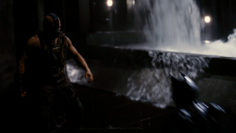
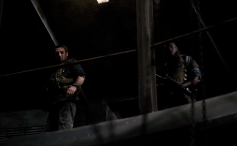
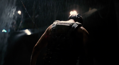
Use of micro-elements in The Dark Knight Rises-

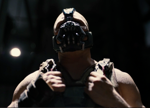
The Dark Knight Rises uses a combination of the four micro-elements; Camerawork, editing, sound and mis-en-scene to create meaning. Here they are used to shoe that Bane is strong, evil, and brutal, While Batman is the good guy but weaker.

Bane is shown to be a strong and intimidating man, as he is introduced with a low angle shot that makes the audience feel they are looking up at him, they’re smaller then him.

Image

Bane punches Batman out of frame, becoming the only figure in the shot; Bane controls the scene; leads it.

Image

Although the camera work and pace is calm, with shots lasting quite a while, momentum is kept through constant movement by the camera. The camera pans, zooms, or rotates around the actions and makes some movement, however small, in each shot.

The pace of the editing is quite slow and lingering. Shots hold for quite a while rather than cutting on each punch. The editing doesn’t hide the violence and makes the fight a show of force rather then about skill. This pace also makes it less of a fight and more of a beat-down on Batman; Bane just hitting him over and over with others watching.

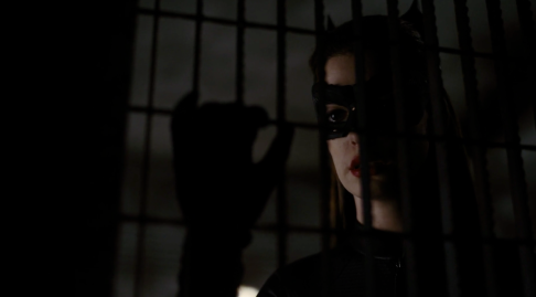
Reaction shots of Selina Kyle looking upset communicate how serious the fight is, she’s worried about Batman.

Image

Reaction shots of Banes henchmen show they aren’t worried, they know Bane is going to win. Also, the fact that Bane has all these henchmen but doesn’t feel he needs them to defeat Batman shows how strong he is. Even as Batman hits Bane they don’t react.

Image

Bane looks visually stronger then Batman, his costume designed to leave his muscular arms bare and exposed and is combat gear adding to the bulk of his chest.

The lighting is dark and sinister. With spotlights pick out parts of the figures and contrasting with areas of shadow. This shows this is a dark and villainous scene, not a heroic one.

Image

Bane is calm throughout, giving a speech over the whole fight. However Batman is grunting and roaring; he’s putting huge effort into the fight, he’s struggling.

There is no music in the scene but it’s really driven by the Foley punches. This emphasizes the brutality of the fight with the focus being on the punches and impacts.

Banes footsteps are huge and thudding, however Batman’s feet don’t make a sound. This emphasizes Banes mass and weight.

Image