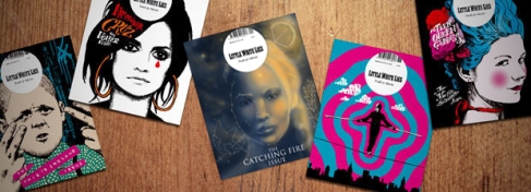
1) Be recognisable – those familiar with the brand should be able to spot it easily.
The cover fits the conventions of a little white lies cover: the close up, straight on portrait and the distinct LWL Masthead in the correct place and built into the design. It also fits the trend that a lot of the covers have, of the character looking out and making eye contact with the reader. Also the way it’s different from the typical film magazine cover can mark it out as Little White Lies, the style the trend on LWL covers is to be unique.
2) It should be emotionally irresistible by the appeal of the main image – does your image generate an emotional response?
The cover is striking, and represents the character as a hero and maybe even something a bit mythic. It’s quite epic and dramatic but also has a softer, more mystic and sentimental look with the clouds and stars.
3) Magnetic and curiosity arousing – to pull the reader in.
The cover is mysterious and enigmatic, first in the basic concept of showing a mystic cloudy night, and second in the fact that the Hunger Games subject isn’t immediately obvious. The stylized version of the main character is the first pull, seeing this portrait draws the reader in at first glance. But the ‘Hunger Games’ isn’t immediately obvious at first glance; the cover makes the reader hunt the cover for the subject movie, which will become more obvious as they see the images in the stars. The cover is made so that there is enough of the Hunger Games to draw the audience in, but not so much so they can glance and easily indentify then dismiss it.
4) Intellectually stimulating – promising benefits.
Little White Lies promises a unique and artistic viewpoint, something quite highbrow, which is shown by its tagline; “Truth and Movies” It also promises and artistic and well crafted magazine. My cover continues this, as it’s a unique interpretation of the ‘Catching Fire’ film. It doesn’t use obvious ideas like fire imagery, but goes down a quite weird and interesting design path. The design also looks artist, and well crafted.
5) Efficient and easy to scan – introducing your service and making it clear.
The cover will be recognizable to those familiar with the ‘Hunger Games’ brand. The likeness of the main character is strong and clear, and she’s always very heavily associated with the franchise. The inclusion of the MockingJay symbol is also a clear marking, and the colour scheme of cold blue and warm orange will evoke the films and books in fans minds. Although I do think there’s an idea of a hunt to find the film, it’s a very easy hunt and only serves to draw the reader in.
The font is bold and clear, stark white on the cover and easy to read on a glance. I’m not sure about the placement of the font, and if it’s in the best place for a reader to pick it up on a quick scan. Better placement might have been for it to go near the top on the left, making it easy for the reader to pick up as they track across the cover right to left.
6) Logical – makes sense as an investment.
Little White Lies is very niche. What’s its target audience are looking for and what to invest in is not really information and news and coverage. What they want is something different with a unique viewpoint, and something with artistry and design and some sophistication. My cover shows that they’ll get this in the magazine, with a different take on the movie and a very designed cover.


