Here I outline the Photoshop editing process of my final four photos with screen shots from editing.
Tag Archives: Photography
Final 4 Photos

In the first shot I wanted to create something grand and epic, building an impression that the subject is some kind of hero. To achieve this I used a orange golden light, almost that of a sunset. Using natural light in the image as a guide I created some eye catching contrast with a light and dark side of the subjects face. In terms of character this also adds an edge, as it suggests there is a duality to the character. To strengthening the lighting effects, and draw focus onto the characters eye, I placed a lens flare on the lens of the glasses. I thought this also strengthened the filmic effect I was going for, as many big films released recently feature flares, both in the film and in the marketing. It’s almost become a staple of the kind of product i’m aiming to emulate.

I picked this as one of the final photos just because it had so much character to it, with the low angle and disinterested stare creating this guy who’s powerful and above it all. My goal here was to us Photoshop to enhance the strong character already established in the image. The black void background backs sure all focus is on the character, whilst the blurring speed lines emanating out of him give him a sense of power, like the photo frame can’t contain him. Through this blur his face is clear and glaring out, made a focal point by being the sharpest point of the image. I also popped out the green in the image a bit in colour correction, as I thought that the venomous and slightly poisonous nature of the colour would fit the arrogant and cold gaze.

I chose this photo because I really liked the way the full body shot created quite a powerful image, with this figure standing alone in a large space, with his hood up to suggest he’s withdrawn and mysterious, but posture suggesting he’s ready for action. To heighten the isolation I connected with I took out the background and replaced it with a black void, and to go with the mysterious nature of the subject I rendered some clouds in the background, that also serve to focus the character.

This was one of the most interesting shots, as it uses depth in an interesting way while still holding to the conventions of the magazine cover. Like in my first image I added a lens flare to increase the power of the image, as well as the motion lines in the background, blurring out from the subject. What I really felt in the shot was a sense of power, like the character holds some kind of energy in his outstretched arm and his ready to let it loose on the viewer. Because of this I thought bringing up the reds would be a good idea, to really strengthen the power, energy, and air of danger I thought was present in the raw photo.
The Photoshoot
I chose these because they most held the two elements I’m looking for, character and tone. SFX cover subjects have relatively simple poses, with the subject upright and still, although sometimes holding out a hand or object to create a foreground and background. However subtly adjustments to the pose and angle of the camera bring across the character. For example on the 4th picture the camera is slightly at a low angle, and the subjects head is tilted back. This coupled with the lofty, disinterested look, creates a arrogant character. Contrast this with the 6th image, which features a full body shot of the subject, hands in pockets and hood up. This creates a guarded and mysterious character, kept at a distance from the viewer, and this mystery suggests a horror tone. Like SFX covers, these chosen photos are quite stark, plain images of the subject, keeping it simple enough to fit on a cover, whilst also conveying a character, and evening suggesting the tone and genre a bit.
From these 12 I will narrow it down again to 4 shots that I will edit to bring them even closer to being sci-fi/horror images. A lot of the conventions of the SFX cover lie in the effects and filmic colour correction on the subjects, so working with my final images in Photoshop will give them the final polish, and further enhance the character and tone.


Photoshoot Plan
I also created a sheet of some loose digital thumbnails, that represent some initial ideas for shots along with notes on them. I will print this off and take it to the shoot, so I can refer to it.

Pictures in the style of a product
The task was to take five pictures in the style of the product I did detailed research on; “SFX” magazine. These are just tests to try and work out the style, before I move on to my final photo shoot.
Of the many picture I took these are the five I picked.


The next step was to choose three of the five images and alter them in Photoshop: New back grounds, Colour correction, lens flares etc.
Before:

The first step here was to cut out the figure and place him on a black background. I then added the sort of explosion effect with just an orange brush on a lowered opacity.
I played around with the RGB curves, altering the contrast. I tried to give the skin a kind of smooth, mat, look, to help it feel polished and cinematic. Finally a warming photo filter gave the figure his red-ish tint.
The effect I was going for was an image representing an action movie or prehaps TV drama that has a very polished and “done up” look.
After:

Before:

This one was probably the most complicated. I wanted to give the whole picture a blue tone and so photo filtered it that way and added the blu lens flare. However this gave the skin a really pale and lifeless look. So I made a layer that just covered the skin, trying to make it a bit reder and warmer. On top of this i used a very soft and low opactiy brush to draw in a blue light on the face and hand which represents the light from the lens flare.
I also cut out the eyes and pasted them onto a seperate layer so i coul brighten them and bring up the green level.
The idea behind all of this was to give the picture more colour. Whilst I liked the cold blue look as it matched the space theme it sort of left the figure looking very dull. I really just tried to sharpen it by putting more colour into it.
After:

Before:

For this picture I cut out the figure, placed him on a black background, and built up layers of mist infront of him and in the background.
For the couolors I used the RGB curves to ramp up the green of the whole picture. I then created a transparent black layer and used the brush to draw shadows on the left side. I then had another transparent layer which I used to paint a transparent green over the right side.
This just accentuated the light and shadows already in the picture, the shadows were already on the left and the lightest side the right.
Some other things I tinkered about with were the sword length( I just used free transform to stretch it out) And the colour of the figures shirt. In the original photo it’s striped pink and that didn’t really match the mysterious and intimidating tone. So I used the lasso to select just the visibal t-shirt, copied that into a new layer, and then used the image adjustments Black and White”. In hindesight I probably should have asked the subject to just wear a different shirt but I wasn’t really thinking about what the final tone of each picture would be at that stage.This is a mind set I should work on when taking an future photos.
The final thing added was a lens flare, put on the right to match the photos light sources.
I idea with the fog, green colours and accentuated shadows was to make the image creepy and mysterious, a tone sugested by the figures expression and cloths.
After:

Detailed Product Research: ‘SFX’ Magazine
SFX Magazine is a British magazine featuring news, reviews, and other features relating to Sc-fi and Fantasy films, television shows, and even comic books cartoons, and literature. It’s published every four weeks and has been running since 1995.
The Magazine is specifically marketed towards fans of the Si-fi genre. Because of this they don’t often need to explain their covers or articles, as most buyers will already have a knowledge of the film or show the cover represents. This is why the covers are so simple. All they really need to do is show the film or show in a basic way and promise news and features on it within. The target audience will know what it is but want to read more.
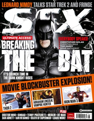
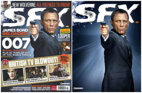
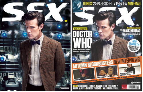
The style of the cover photos is often a portrait of a character, James Bond, Harry Potter, Batman, etc. They are always pictures of the actors done up and in character, usually in a moment of the movie; reacting to something in the distance or conveying an emotion their character would feel. The actors are never just the actors on the cover.
Often the covers will have a strip running across the lower half of the page, featuring smaller images representing other upcoming films/shows. These are often just screen grabs rather then set up photographs.

The interior pages are also very simple. The idea being to show off the pictures and text in an easy to read way, whilst also making each page very striking. Each page usually features one big image with strips of text, and sometimes smaller pictures, running down the sides or across the bottom. This creates a boarder for the larger picture, framing it. A large picture is always the center of attention and is placed to make it so.

With each page pretty much one big picture the pages will each be attention grabbing and unique, it sort of seems designed to pull in anyone flicking through the magazine.
3 Different Products
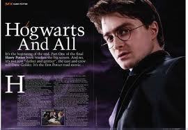
Cover of ‘SFX’ Magazine: a film magazine with a particular focus on sci-fi, action and fantasy

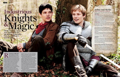
Example of intirior pages.

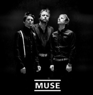
Band photography and album covers from the band; ‘Muse’, a british rock band.


Movie posters from ‘Iron Man’ and ‘Star Trek’, sci-fi action movies with ‘Iron Man’ being a super hero film.


Photography Research – Landscape
TONY WHITTLE -Landscape Photography
Based in the Peak District, he’s perfectly positioned to capture the breathtaking moods of this dramatic Landscape. Tony’s philosophy for capturing great landscape photos is to make the most of every interesting weather opportunity in our great countryside. Tony has won many awards for his landscape photography and creative images over the years. His work is also shown at many prestigious local and national shows and exhibitions.
( Photos and description from http://www.tonywhittle.co.uk/)

I love the way this picture gives a really dramatic sense of scale. Without the tiny figures the picture would seem small and lifeless, but with the people the landscape comes to life: seems epic. Everything dwarfs the tiny men. The black and white makes it even more striking and the sun is really harsh to the eyes. Every element makes it bold and striking and slightly intimidating.
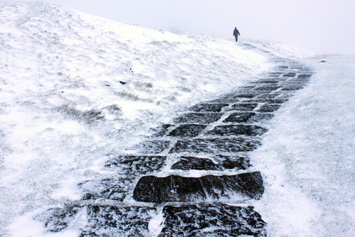
Again a tiny figure is used to give the landscape a huge feeling. But in this one we also have perspective; the leading lines of the road give the photo depth and almost create a sort of story: a journey.
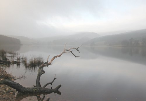
This one is really mysterious. The gnarled branch is the focus and it almost seems that the rest of the photo is negative space. But hills and sky peep through the fog and give the impression that there are things in the background we can hardly see.

Once again the clouds are made epic by the tiny tree show us how big they really are. The orange light looks violent and dangerous, and the sun behind the clouds gives them sharp contrast. The shafts of light cutting through the cloud also seem a bit deadly.

This picture is the softest out of the 5. We do have the small figures giving the scene great scale, but this time the landscape is all pastel, light colours. The darkest part of the picture is the figures and this creates a dream-like atmosphere. They are surrounded by the soft yet huge landscape which has an air of fantasy about it.
Photography Research – Documentary
JACK HARRIES
I can’t really find anything about Harries. The only real information I can find is that he is self taught and works in the photography fields of film, travel and social documentation (http://onegiantarm.com/2012/09/18/jack-harries/#more-13998)

This picture really feels mysterious. It has a pretty cinematic quality, almost as if it was a movie still. All of Harries’s pictures have this effect which is pretty interesting with documentary photos. I also like the distance; the small window of light and the figure within creates a frame watching a frame and makes us feel like we’re spying from the darkness.

The light here works really well. The single beam of light defines everything, the arm of the guitar and the second man. It makes everything harsh and very striking.

In this picture it’s the perspective that I really love. The way the swirling lines go off into the distance really draws you in. It also makes you feel slightly sick; it’s sort of off putting.

The silhouettes and the way they’re watching out the window, is sort of creepy. The man’s head nicely fills up two thirds which really draws attention to it. The drifting curtains and wind chimes make the mood very ethereal.

This picture has a frame within a frame. The circular window is like a spot light on the top of the man’s body. This gives him intrigue and sort of makes a character. Again this feels very filmic, both in the way it’s shot and the way it creates story and character. Because of the darkness you wonder what these people are doing: Is that broken glass on the floor? Who is this man? The window making him a silhouette strengthens this effect.
Composition Practice

Rule Of Thirds

Use of Leading Lines

Symmetry and Patterns

Framing, frames within frames

Balancing Elements
