Sploder

http://www.sploder.com/

Sploder is a website free to use, where you can create and customise your own game easily. It’s similar to Gamesalad in the fact that it’s all drag and drop, with a big work space or “scene” and then a box of elements you can drag into the scene to build up the level. 

The difference to Gamesalad is that Sploder has less customisability. Your not building a game from the ground up, your customising the scenery and elements within and already set up framework. All the movement controls and enemies behaviours are already there and you just need to move parts around.

Competition Venn diagram

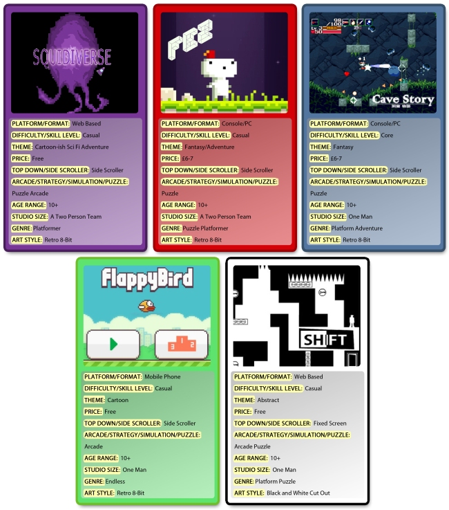
Here I’ve created a Venn diagram to explore what games will be the competition for our ‘Squidiverse’. Each circle of the diagram is based on an area of the fact file, so a Casual gamer circle, a pixel art circle, etc. ‘Squidiverse’ goes right in the middle, as it’s the only game that belongs in every category.

Game venn diagram

The games closer to the middle of the diagram are our main competition, as they overlap with more and more areas. Games in the four overlap areas around the center are the main competition.

Squidiverse Fact File

Platform/Format – Web Based, opened in a browser

Difficulty/Skill Level – Casual

Theme/Flavour – Cartoon-ish sci fi adventure

Price – Free to play

Top Down/Side Scroller – Side Scroller

Arcade/Strategy/Simulation – Puzzle Arcade

Age Range – 10+

Studio Size – A two person team

Genre – Platformer

Art Style – Retro 8-bit graphics

Triple A remake of ‘Castle Crashers’


Castle Crashers new box art

The task here was to Imagine what the indie game ‘Castle Crashers’ might look like if it was re-made as a triple A title.

The basis for the cover was a piece by deviantART user Adrian-Drott: http://adrian-drott.deviantart.com/

castle_crashers_by Adrian Drott

I built the rest of the cover around that image, by adding the logos and fitting it into the Xbox ONE template.

The logo and template resources came from: http://vgboxart.com/

My idea to change this into a Triple A title was to make it a bit darker, and a bit more epic. It has a style that would more easily be associated with medieval times, and Knight quests: that look of weathered parchment or an ancient scroll. Taking out the colour a bit also helps move it away from being as zany and cartoon-ish as it was before.

The main element I worked on was the ‘Castle Crashers’ logo, which I wanted to style so that it would fit more with the darker, parchment based image. First I took the colours out a bit by adding a colour overlay with the colour of that dark brown the background has on a lowered opactiy. So the colours are still there but muted. I then got a rusty metal image from the internet and laid i overtop the logo with a layer style of Soft Light, so that it would blend with the text. But I wanted the texture to only be on the flat of the font, rather then the black outlines, so I could preserve a Three Dimensional look, so just with the magic wand tool I selected all those black areas with the wand tool on the logo layer, and then went over to the texture layer and with that same area still selected, deleting those sections.